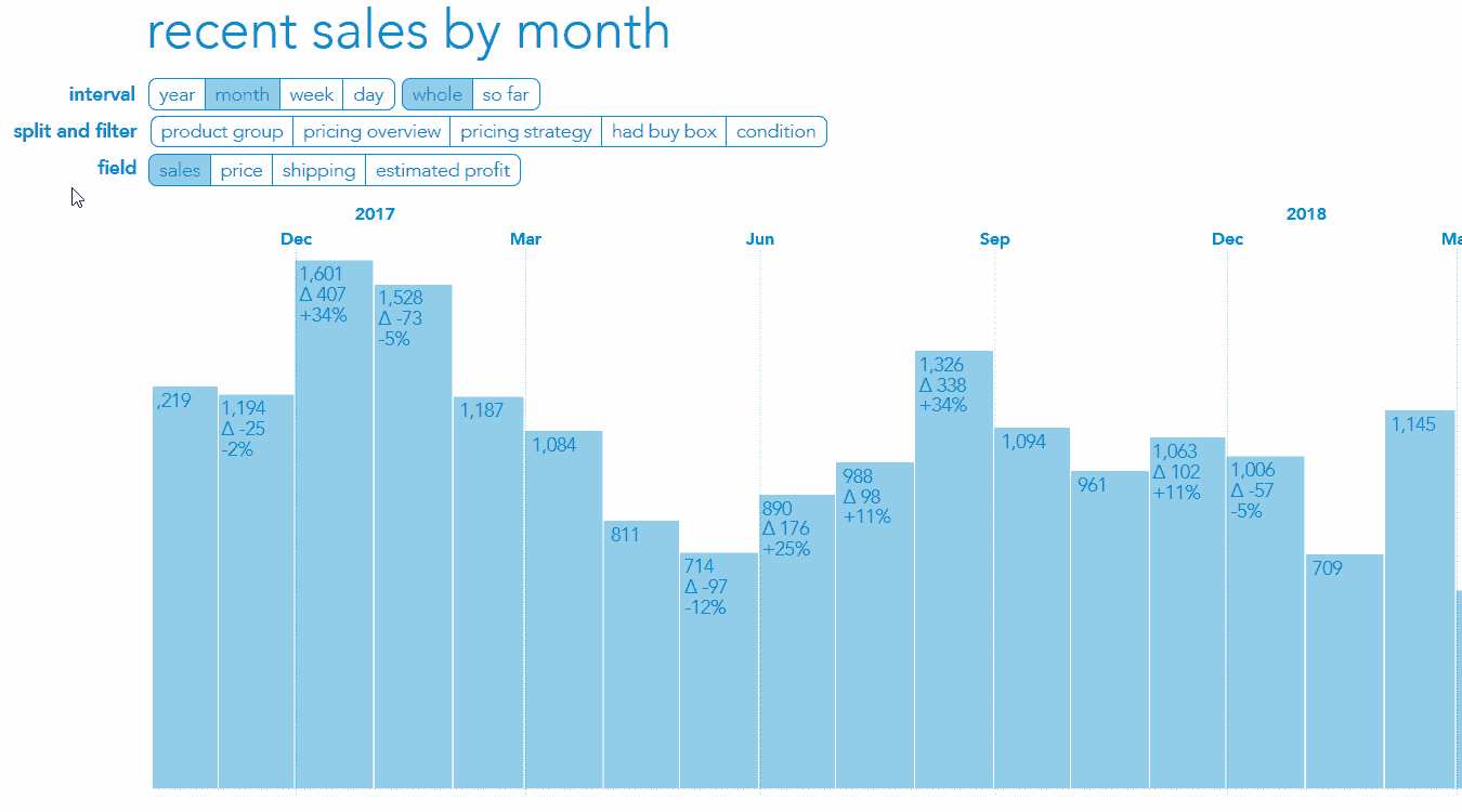
If you are reading this document then you’re one of the Amazon sellers we’ve picked to offer exclusive access to a new feature we are currently working on. For now, we call it SalesChart by SellerEngine. It’s meant to give you insight into your Amazon business by providing segmented sales data in a comprehensive way.
SalesChart lets you drill down through historical data on sales, shipping, and estimated profits. You’ll also be able to segment data based on accounts (if you have more than one) and split inventory based on product categories, Smart Lists you currently use in Sellery, and more.
As you’re going through each set of features shown below, please take note of any questions you run into and any feedback that comes to mind. We’d like to ask you to share your feedback with us so we may further develop this feature. Send us your feedback via support@sellerengine.com.
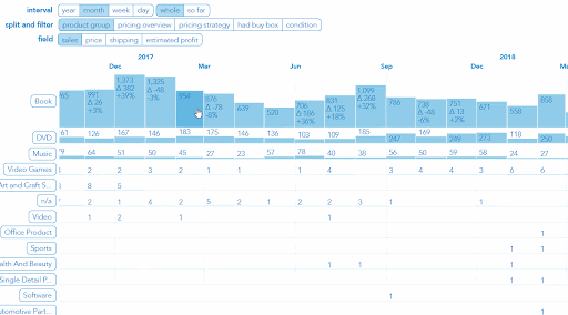
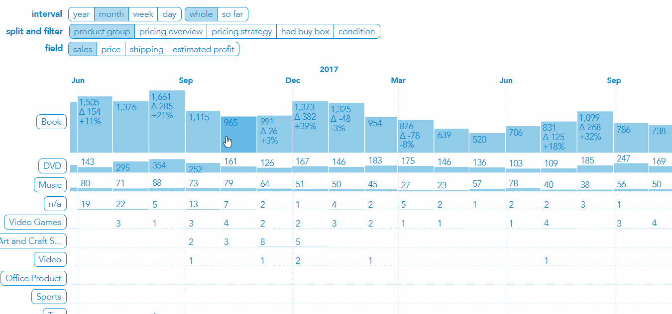
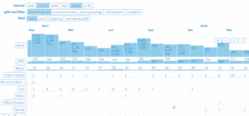
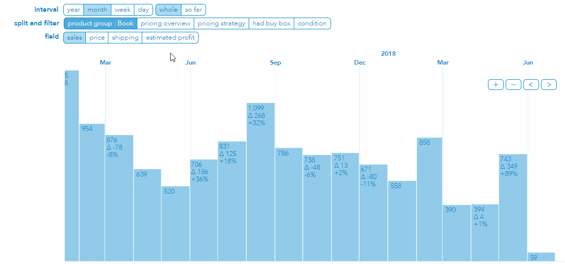
Split and Filter
→ Use buttons next to ‘split and filter’ to split your sales by different properties of the sale.
Once you click on one of the split and filter options you’ll see your sales split in multiple rows with the name showing on the left for each row. For example, if you split by ‘product group’ then each row will show your sales over time in a particular product group.
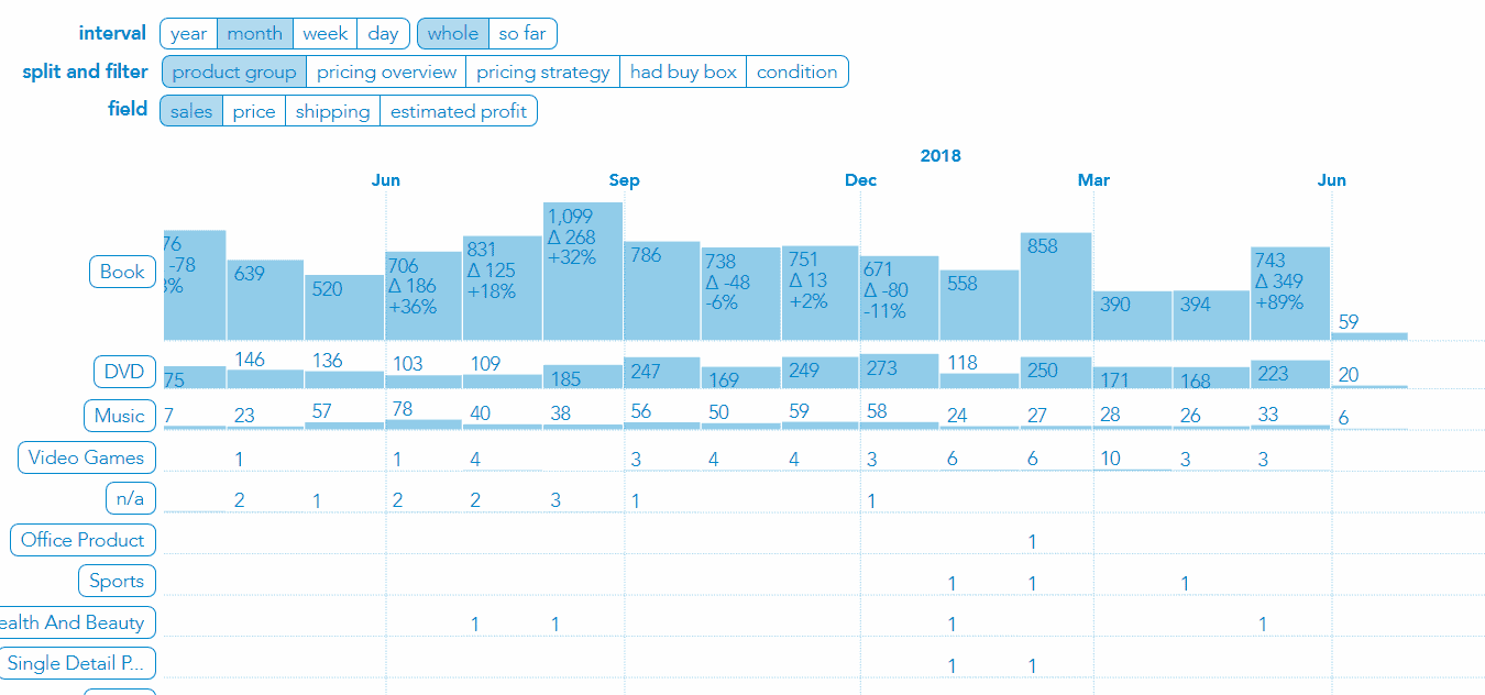
Drill Down
Drilling down means refining what you see to look at a specific segment of your sales. This is done by picking out a row you want to look at in more detail.
→ Click on one of the row labels that appear on the left after splitting. You will now see only the sales in that row.
→ To go back one step click on the split and filter option initially selected.
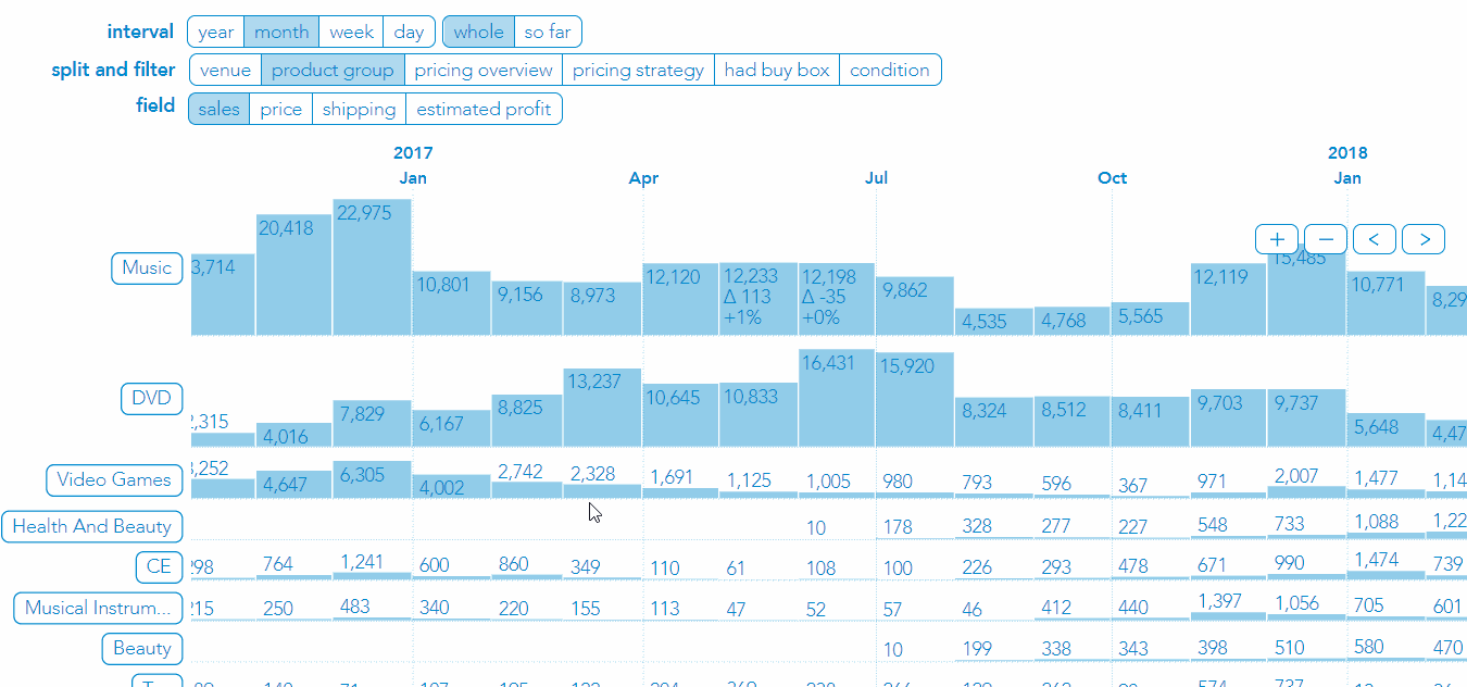
Drill Down Then Split Again
→ After drilling down you can perform another split to gain more insight on the segment you’re looking at
In the example above, we are showing all the estimated profit on sales of DVDs split by whether or not the seller had the buy box when the sale happened.
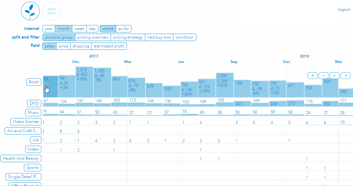
Navigation
→ You can click & hold to scroll through data horizontally.
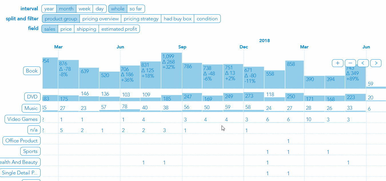
→ Or you can use the [ < ] and [ > ] buttons for the same purpose.
→ You can zoom in and out using [ + ] and [ - ] buttons.
→ For additional accuracy, you can zoom in vertically; use the mouse scroll wheel while holding the ‘ALT’ key - this makes graphs taller to better assess visually the difference from one bar to another.
Save Reports
Once you’ve drilled your way down to the data you want to see, in case you want to come back to the same view later you can save a report.
→ To save a bookmark click the dotted line button in the header, choose a name for your bookmark, then click the [ ok ] button.
→ To delete a bookmark simply click and drag the bookmark out of its place then you’ll see it disappear.
→ To edit a report double-click on the report button.
Whole vs. So Far
This pair of buttons allow you to toggle between looking at graphs for the whole time interval that’s been selected (year, month, week) and looking at graphs that compare sales made so far in the current interval to previous intervals up until the same point. For example, if the interval is set to month, and today is the 10th of the month, when you toggle from whole to so far the data for each month shown in the graph will modify to show sales made until the 10th of each of the previous months.
That’s all there is to it! We hope you find this new feature useful, but more importantly that you won’t hold back when it comes to sharing your feedback. Being real about it will help us most. :)
Comments